On the Sunshine Coast we love books. You can’t swing a gumboot here without hitting an author, and our Festival of the Written Arts has just celebrated its 36th successful year. Here we appreciate books from both sides of the cover. And we also appreciate the covers!
Printed books can be a tough sell these days, though, with technology changing our habits, inclinations, and even our attention spans. This means the look of the book matters a great deal. The title, the colour, the print, the size, the font, the images on front and back . . . all influence what gets picked up and what gets passed over. ZOOM talked to Roger Handling, Creative Director of Terra Firma Digital Arts. You know his work. It is everywhere: brochures, pamphlets, for resorts and real estate, government, tourism, hospitality, on the web, and in print. If it is eye-catching, there is an excellent chance Roger has been involved. Book covers might well be Handling’s favourite work.
“I’ve been a bibliophile ever since I was a kid, as well as a compulsive drawer. My parent’s house was full of books. Being able to combine my penchant for visual expression and creativity with a medium I’ve always spent so much time immersed in is rather satisfying.”
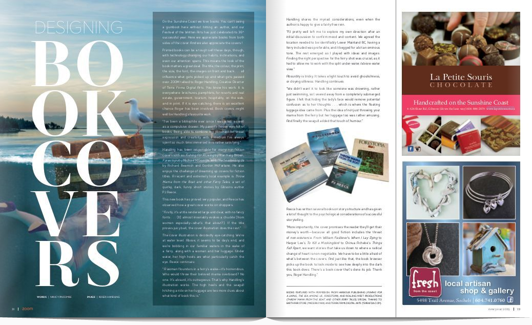
Handling has been responsible for many non-fiction covers such as Fishing For A Living by Alan Haig-Brown, Forestopia by Michael M’Gonigle, and The Sea Among Us by Richard Beamish and Gordon McFarlane. He also enjoys the challenge of dreaming up covers for fiction titles. A recent and extremely local example is Throw Mama from the Boat and other Ferry Tales, a set of quirky, dark, funny short stories by Gibsons author PJ Reece.
This new book has proved very popular, and Reece has observed how a great cover works on shoppers.
“Firstly, it’s a title rendered large and clear, with no fancy fonts . . . (It) almost invariably evokes a chuckle (from women especially—what’s that about?). If the title proves juicy bait, the cover illustration does the rest.”
The cover illustration is decidedly eye-catching. We’re at water level. Above, it seems to be day’s end, and we’re bobbing in our familiar waters in the wake of a ferry, along with a woman and her luggage. Under water, her high heels are what particularly catch the eye. Reece continues:
“A woman flounders in a ferry’s wake—it’s horrendous. Who would throw their beloved mama overboard? No one. It’s absurd, it’s outrageous. That’s why Handling’s illustration works. The high heels and the seagull hitching a ride on her luggage are two more clues about what kind of book this is.”
Handling shares the myriad considerations, even when the author is happy to give a fairly free rein.
“PJ pretty well left me to explore my own direction after an initial discussion to confirm mood and content. We agreed the location needed to be identifiably Lower Mainland BC, having a ferry included was preferable, and it begged for a bit an ominous tone. The rest emerged as I played with ideas and images. Finding the right perspective for the ferry shot was crucial, as it had to allow me to work with the split under-water/above-water view.”
Absurdity is tricky. It takes a light touch to avoid ghoulishness, or cloying silliness. Handling continues:
“We didn’t want it to look like someone was drowning, rather just swimming, so I veered away from a completely submerged figure. I felt that hiding the lady’s face would remove potential confusion as to her thoughts . . . which is where the floating luggage idea came from. Plus the idea of not just throwing your mama from the ferry but her luggage too was rather amusing. And finally the seagull added that touch of humour.”
Reece has written several books on story structure and has given a lot of thought to the psychological considerations of successful storytelling.
“More importantly, the cover promises the reader they’ll get their money’s worth—because all good fiction includes the threat of non-existence. From William Faulkner’s When I Lay Dying to Harper Lee’s To Kill a Mockingbird to Chinua Achebe’s Things Fall Apart, we want stories that take us down to where a radical change of heart is non-negotiable. We have to be a little afraid of what’s between the covers. And just like that, the book browser picks up the book to look inside to see how deeply into the dark this book dives. There’s a book cover that’s done its job. Thank you, Roger Handling.”
Words | Nancy Pincombe